Overview
The Chicago Apartment Hunter site is designed to be an accessible tool for stress free apartment hunting. The website breaks big data list into smaller increments. Search filters allow the user to sort results according to their desired criteria. And property listings feature detailed quality pictures. Our target user is age 18 or older.
Timeline
April 2022
to May 2022
Role
Sole UX designer
Sole UI designer
Sole UX researcher
Tools
Adobe XD
Adobe Photoshop
Pen & Paper
Chicago Apartment Hunter Website
When hunting for an apartment, sifting through endless listings that don't meet your specifications, have vague descriptions & poor quality photos can be frustrating. Moreover, making time to attend a showing based on an inaccurate listing only to find that the apartment is not up to your standards is even worse.
The Apartment Hunter website makes finding a suitable apartment less daunting by offering intricately detailed filtering and requiring listers to post high quality pictures as well as provide thorough and accurate descriptions.

The Goal
An apartment search engine that adheres to search parameters. A property database that’s been curated to be true to listing. Search data presented in smaller friendly increments.
The Problem
Apartments often do not match their description as listed.
Limited filters fail to shorten lists.
Search results don’t match filter settings.
User Research Summary
The goal of my research was to fine tune the typical apartment hunting website with curated search results by using special insights gleaned from an affinity diagram based upon participant feedback. The primary users would be those that have particularly discerning tastes or those that may be searching on a deadline.
A usability study was conducted using low fidelity wireframes. From those interviews I drew affinity diagrams. The patterns I discerned in those diagrams yielded insights that refined the initial design of the website.
User insight pivoted my design from a focus on simplicity to greater emphasis on accessibility. Another insight was how overwhelming search results could be. It occurred to me that the data could be presented in more digestible increments.
User Pain Points
1
Dishonest
Listings
False listings designed to lure interest. This can be avoided by curating a database that’s true to listing.
2
Bereft of
essentials
Users want to be close to transit, grocers, public parks, etc. Let’s put those common requests into presorted lists.
3
Limited
filters
Having more filters help reduce result list that are overwhelming and full of unwanted listings.
4
Results ignore parameters
It is entirely feasible to tighten returns to better adhere to search parameters.
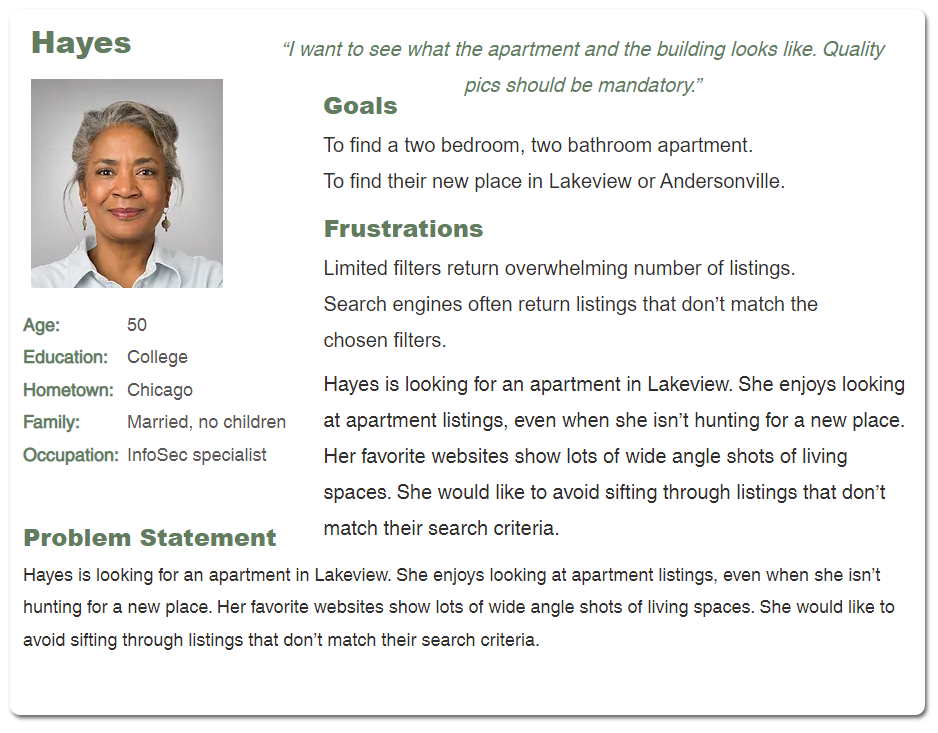
User Persona
User Empathy Map

Usability study: findings
The goal of my study was to collect KPIs that would inform the project’s future mockup and hi fidelity prototype. My three main findings are listed below.
1
Redundant buttons
Request tour & contact property buttons lead to same page. They should be consolidated.
2
Categorized cards
Categorized property cards on homepage expedite some common searches, keep them.
3
Maintain simple format
The current format is intuitive and easy to use. Maintain this information architecture.
Starting the design
The sitemap
I went into the site map with common search parameters in mind. I saw those parameters as the core of my website’s information architecture.

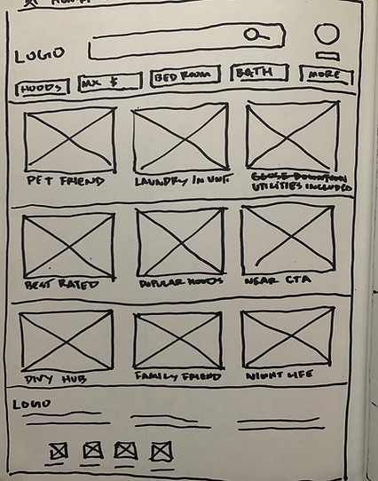
Paper wireframes
My thoughts were on common asks when searching for a Chicago apartment. So I wanted cards on the homepage linked to results to those specific search queries.

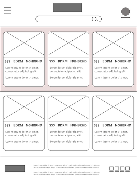
Digital wireframes
The digital wireframes for my iPad and mobile homepage. The screen features a nice amount of search cards but not so many as to overwhelm.

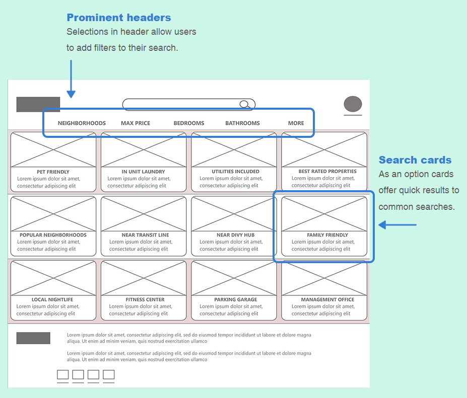
Low-fidelity prototype
The lo-fi prototype follows the user as they choose a property to contact with questions or to schedule a viewing. Feedback from users pointed out overwhelmingly voluminous search result lists as a pain point. I also took concerns over living close to essentials like the grocer or public transit. As a result, I placed fast result cards for those on the homepage.
Mockups
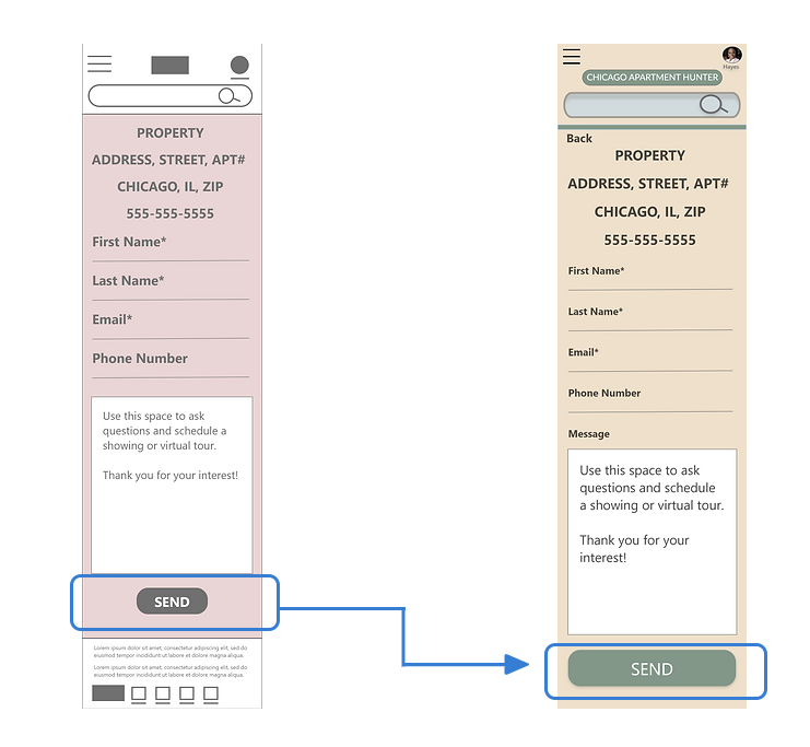
My mockups cover sizes for desktop, ipad and iphone. Designs for the desktop property page are included in both lo-fi and hi-fi below. The lo-fi mockup shows the buttons, “request tour” and “message property”. Both lead to a message screen. Users found this misleading. And so both buttons have been consolidated into a “contact property” button in the hi-fi design.

Insight from a usability study suggested larger buttons were easier to reach. That change made its way into my hi-fi design.
High-fidelity prototype
The hi-fi prototype follows the same user journey as the lo-fi prototype. It also includes changes that address the same feedback and concerns gleaned from the usability studies.
Open Hi-fi Prototype
Accessibility considerations
The goal of my study was to collect KPIs that would inform the project’s future mockup and hi fidelity prototype. My two findings are listed below.
1
Color contrast
My design includes contrasting colors to aid those who perceive color differently.
2
Screen readers
Screen readers will use headers and labels to make the site useful to the blind.
Takeaways
Participants enjoy the color scheme which has been observed to be pleasant on the eyes. The intuitive information architecture has also garnered positive feedback.
I learned that accessibility should always be foremost in mind when choosing a typeface and color palette. I’ve also learned that there’s a wealth of information out there to help me make future designs accessible.


